
I am actually attending a major conference in the Bahamas today and therefore my post will be a bit brief. Therefore today I am wearing my hat as founder of Designers For Darfur which after much success find ourselves at a very pivotal moment in our evolution – “we are being branded”…
The magnificent company that has taken on our project is responsible for some of the most recognizable campaigns on the market today. However, I will keep their name a secret for now as they have taken on our project pro-bono and I do not want to be the cause of every charitable organization in town beating down their door.
Well two days ago I met with this firm of creative geniuses and they presented me with several new logo options… I was floored by their visions… They presented me with several amazing logos - - - each one as viable as the next. So this leads me to today’s post… I need your help in deciding which logo to choose… Below there are several options – please leave me a comment with your choice of Logo 1, Logo 2, or Logo 3…
Thanking you in advance for your help once again…
LOGO 1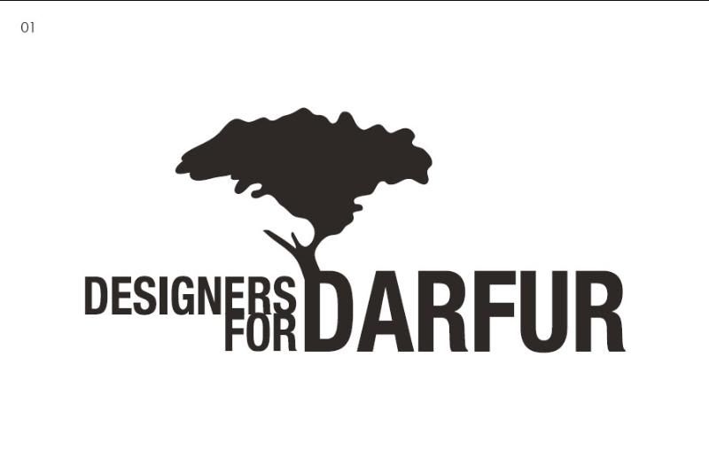
LOGO 2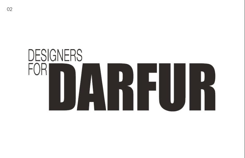
LOGO 3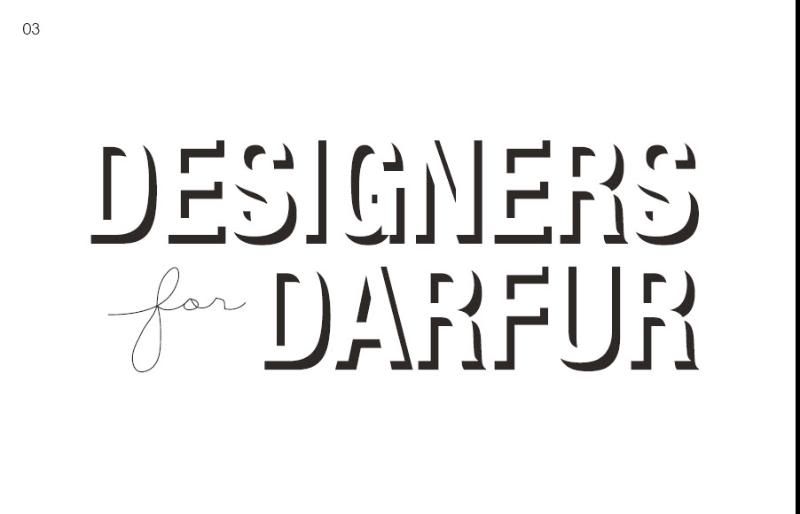
Thursday, October 11, 2007
Change of Hats - Designers For Darfur
Subscribe to:
Post Comments (Atom)


7 comments:
I like logo 01, although they are all very nice. Congratulations on this milestone!
I am torn between Logo 1 and Logo 2...as I truly love Logo 1, I feel that Logo 3 is much more commercial....not that the Logo has to be. Whichever you chose, it will be brilliant...
Logo 1 is the best. The visual message indicates Life and growth. I love it! BTW! Your new collection is light and pretty, wonderful and fluid! You Go Boy!
I love Logo 1. And I must agree with Styin - your new collection is amazingly beautiful. You seem to be one of the rare designers (like myself) that actually thinks about women.
p.s. thanks for coming to my show
Mal, I love logo 01...it's wonderful.
I like Logo 1. Trees symbolize growth and protection. I'm not sure if I'm crazy or my eyes are playing tricks on me, but the tree looks very Fat Albert and gang to me (hairstyle perspective).
logo 1.
the marriage between the typography and image say a lot.
Post a Comment